Wednesday, April 29, 2009

Website


NEW WEBSITE: CLICK HERE!!


Week 14


Assignment:
To finalize our website.

Craft:
The application iweb was used in order to create a simplistic website to display our magazine spreads.

Composition:
I wanted to create a website that was different from everyone else's. I believe that i accomplished this through the use of the shapes and inspector features. I created a unique website by using the stars and creating colors that tied in with my chosen colors for my website. I also found that the star can be given more rays. I took advantage of this and created an eight rayed star that looked like a sun. I added color to it in order to give it a fun feel. I chose blues, pinks, purples and black as my color scheme for the website.

Concept:
The concept was to create a unique website in order to display our magazine spreads. This is a technique that taught us how to distribute our artwork. This website is also a very good way to allow your name to become known in the public.

Monday, April 27, 2009

Week 13


Assignment: 
To finish up and order a final version of our magazine. 

Craft:
On monday there was a critique of the magazines as a class.  Then wednesday was an independent study day.  On wednesday I finished my cover and made the final adjustments to my magazine.
When on lulu I had to delete the previous pdf file of scribbles and replace it with the final version.  Also the cover was redone and therefore also had to be uploaded.  The cover was made in indesign but then in order to get the exact measurements for the magazine I transferred the document over into a photoshop pdf file.  

Composition:
All the compositions of layouts stayed the same.  The only composition that was drastically changed was the cover.  I enlarged Lincoln so that he took up most of the cover and was the first thing that is seen.  Then the names of the other artists were outlined in black and given a shadow so that they stood out when I over-layed them on Lincoln. These adjustments were created to give my cover more of a magazine feel. 

Concept:
The concept of my magazine has stayed the same. The concept of Scribbles is to have a colorful fun magazine that displays all my classmates' artwork.

Wednesday, April 15, 2009

Week 12


Assignment: This week was just focused on finalizing our cover and creating a website.  

 Craft:  The website was created using iphoto to make a slideshow of our magazine spreads as jpegs.  The actual website was created using iweb.

Composition: The website consists of 3 pages.  The first page is a welcome page to get people interested in the rest of the website. The second page is about the editor.  The last pages is a page consisting of a slideshow of my magazine's spreads.

Concept: The website is a tool that is being taught to us as a class in order advertise our work.  We are being taught various ways to distribute our work and a website was one of the ways to get our name known.  

Wednesday, April 8, 2009

Week 11


For this week the first draft of the magazine was sent to the publisher's.  This was done by saving the magazine as a pdf file.  Then that was uploaded to the new Lulu.com account. The cover had to be saved as a photoshop document in order to get the exact cover dimensions correct.  

Also for this week on wednesday the class started to create websites for their magazines.  This was done using iweb.  There were only two pages created. But all of our magazine was saved individually as spreads in the jpg form.  This website when it is finished was designed to create an outlet to advertise our work. This outlet is ultimately to get our name out there and have people purchase our work.  The 3 things that are going to be taught to help us create the website is: 1. image/text  2. link  3. posting content. 

Tuesday, March 31, 2009

Week 10


Assignment:

To create the last 10 spreads of our magazine.

Craft:
I used indesign to create the last ten spreads like I did for the first ten spreads. There were a lot of baoxes used to design the spreads. Making these last spreads was easier than the first ten because i had templates that I already had created.  That made the last ten faster to create.

Composition:
There were many boxes used to create the layouts. All the spreads consisted of a title, byline, body text, and image. The colors used for the fonts I tried to pull from the featured art on the specific spread. The font I chose I also tried to keep it as the same style as the artwork.

Concept:
The concept of the magazine is to keep all of the spreads similar, so that there is no confusion by the reader. I tried to use the same formula for each spread.

Thursday, March 26, 2009

Week 9


Assignment: This week we were to create 10 spreads.


Craft: These 10 spreads were made using the program Indesign.

Composition: All the spreads were based on the artwork that the spread was featuring. The pages would have the color schemes chosen from the artwork along with the title fonts. These spreads also were created with the same basic formula made from boxes. Every spread has the same formula of title, byline with artist's picture, body text, and featured artwork. The same font size and style was used for the body text throughout all 10 spreads.

Concept: The overall concept of the spreads are to keep them simple with interlacing themes that bring them together. The point of the interlacing themes are so the magazine will come together as a whole when it is published.

Wednesday, March 18, 2009

Week 8


Assignment:
To create 2 magazine spreads using both our Lincoln illustration and the text/illustration creation.

Craft:
I used Indesign in order to create the two magazine spreads. These two spreads were created in order to incorporate the element of boxes. Looking at magazines in box -form makes it easier to create magazine spreads.

Composition:
The magazine consists of illustrations that take an entire page of the spread. The spreads were created with boxes in mind. So both spreads have boxes for the headline, byline, and body text. There were additional boxes that acted as accents. These accents pulled out certain designs from the featured illustrations.

Concept:
The concept of these spreads are to have the focus be on the artwork. The artwork takes up most of the spreads. And the illustrations also inspired the colors for the headlines and bylines. There were also accent boxes that took elements from the main illustrations. All the elements of the spreads lead the reader back to the artwork. The text is secondary in this magazine.

Tuesday, March 10, 2009

Week 7


Craft:
I used Adobe Illustrator and played with the text following a path, gradient, font, and pencil tools. These features allowed me to bring a treasure map to life.

Composition:
The piece has a worn old parchment paper in the background that aids in the visual clue of seeing a treasure map. The arrows are made out of words. These words were typed in Lambretta font that give a natural boxing-in of the words to make them appear more arow-like. There are three major building scenes that I have to pass through. There are also gray symbols that represent things that are earned at each building scene.

Concept:
The concept of this illustration is that there are different forms of schooling that I must pass through in order to achieve my dream job. I started to take school seriously in college and that is also the point where I decided I wanted the dream job of being a medical illustrator. So my treasure map starts at college and travels through graduate school and finally to where I find my treasure in the city when I am hired as a medical illustrator. The different icons that are on the map for each place are graduation caps (college), diplomas (graduate school), and money (the city). The arrows that represent the path I must take in order to achieve my goal are made out of words that read "determination, perserverance, hard work, focus...are used to achieve my ultimate goal."

Lincoln Editorial

“Punk Union” Lincoln Editorial

Craft:
For this project I used a photo of Abraham Lincoln that I had found using Google image search. I made sure to choose a picture that was made up of a lot of pixels so that it was easier to work with and manipulate. This photo aided me while I used Adobe Illustrator to create the different variations of Lincoln and the final product. A few of the features of Adobe Illustrator that helped the most in this creation were text, gradient, swatches, opacity, pen tool, and the pencil tool. These tools were the ones that I used to create all the Lincoln variations and the final “Punk Union” Lincoln.

Composition:
The composition of this project started with the photo of Lincoln that I chose. I chose this photo of Lincoln because it was larger and focused more on his face. This was not a photo of Lincoln standing or a full body shot of the president. I liked that the face was the focus of the picture, and there was not much else to distract the viewer. When this project started I knew that I did not want my Lincoln illustration to be realistic. I did not want a realistic illustration because when I heard Adobe Illustrator I thought of cartoons rather than photos or realistic works of art. Keeping align with the cartoon mood of this piece I chose to make President Abraham Lincoln into a punk rock musician. In order to do this I had to adjust of few key pieces from the iconic photo I was illustrating from. His suit was changed to just a sports coat. The collared shirt was switched for a mint green t-shirt. The most iconic element of Lincoln that I altered was his hair. The hair is definitely an eye-catching part of this illustration. The purple Mohawk I created stands out as the key stereotypical element of this picture that allows the observer to automatically think punk or rebel. Lincoln is framed between text to give him a border. The vintage concert poster background catches the eye but does not take emphasis away from the main part of the composition...Lincoln.

Concept:
Throughout this whole creative project there were different variations of Abraham Lincoln that I created. The variation that I chose for my final finished piece was the punk rock Lincoln. In order to emphasize the concept of a rebel/punk Lincoln I wanted to put Lincoln in the center of a vintage concert poster. Then as his 'emancipated and united tour' progresses he goes through the different civil war battles. His band name of "Punk Union" also gives emphasis to Lincoln's new style.

Wednesday, February 25, 2009

Week 6


Assignment: To create an illustration combining text and pictures.

Craft: To use Adobe Illustrator and the Linotype Font Explorer X.

Composition:  I have decided to use a map to show that there is direct path to be reached.  The path is made of arrows that will soon be turned into words.  There is a college, graduate college, and the city which represents office buildings.

Concept: The composition is based around the idea of a treasure map.  This is so because I want to convey that there is a linear progression to achieve my goal. In this progression the ultimate goal is my dream job and considered the treasure. 

Tuesday, February 17, 2009

Abe at my house :)


Abe in his new home. :D

Week 5


Assignment: To use both text and pictures for the project.

Craft: To use Adobe Illustrator. Also this project deals alot with familarizing and utilizing the text feature on Adobe Illustrator.

Concept: I'm not sure what the concept of my piece will be yet. I would like to use books and coffee in the picture, but I'm not sure where the text fits in unless the books are textbooks and the words are "My life as a student". Much of my time during the school year is taken up with studying and coffee is normally what I drink in order to stay awake to study.

Composition: I will want the coffee cup to be on the left hand side of the book while also in the foreground. The textbook will be open and the left cover will be resting on a stack of books. The words will be in the upper right hand of the illustration. I envision this piece having a sepia color scheme.

Wednesday, February 11, 2009

Week 4


Assignment:
To put Lincoln in a background that suggests or emphasizes the chosen variation.

Craft: 
For my Lincoln I used a lot of text and and gradient.

Composition:  
Lincoln is framed between text to give him a border.  The background catches the eye but does not take emphasis away from the main part of the composition...Lincoln.  

Concept:  
The variation that I chose was the punk rock Lincoln.  In order to emphasize the concept of a rebel/punk Lincoln I wanted to put Lincoln in the center of a vintage concert poster.  Then as his 'emancipated and united tour' progresses he goes through the different civil war battles.  His band name of "Punk Union" also gives emphasis to Lincoln's new style.

Tuesday, February 3, 2009

Week 3


Assignment: To use the original illustration of Lincoln created last week to create three different variations.

Craft: I experimented with other aspects of Adobe Illustrator. I used opacity, different stroke sizes, swatches, and gradient. These all helped to improve the Abraham Licoln variations to bring each one their own style.

Composition:
Modern Lincoln: I used a gradient to create a suite that looked like it had a realistic shading to bring a more modern approach to the portrait. I switched his traditional bowtie for a modern necktie.

Punk rock Lincoln: His suit was changed to just a sports coat. The collared shirt was switched for a mint green t-shirt. The hair is definately an eyecatching part of this illustration. The purple mohawk stands out as the key stereotypical element of this picture that allows the observer to atomatically think punk or rebel.

Happy Lincoln: The subtle uptrun of the lips of this piece give Lincoln a sense of peacefulness and happiness. The other element of this piece that gives the same feeling is the toning down of his skin color and his suit.

Concept: I am torn between putting the modern Lincoln in a newsroom and having him interviewed. But if I were to do this I would want it to seem as though you are watching this on TV, with the little feed that runs across the bottom of the screen and the network logo on the top. If I chose to use the Punk rock Lincoln he would probably be at a rock concert or seen in an old touring poster for his band 'Redefined Rebel'.

Wednesday, January 21, 2009

Week 2


Assignment:
To create a digital illustration of Abraham Lincoln using Adobe Illustrator.


Craft:
1. Obtained started illustration from last week.
2. Learned new techniques on Adobe Illustrator by professsor and on my own.
3. Brought out the main highlights and shadows of the original image.

4. I only used the pencil tool and the color guide to create the image.

Composition:
I chose this photo because it was a stern looking Lincoln and focused on his face, rather than his entire body. The main idea for my illustration was to keep it cartoon-ish. I did not want a realistic illustration because when I heard Adobe Illustrator I thought of cartoons rather than photos or realist works of art. I used highly contrasting highlights and lowlights in the suit and tie of Lincoln. The hair and beard only have a few small patches of highlights to give the texture of hair. I did not want to do all of the hair and beard with varying strands of grayscale colors because this would have looked too overdone and distracting. The main color for the face is not a normal skin tone color because I did want to keep it cartoon-like. I played around with the color guide until I found skin tones that were slightly darker or slightly lighter than the original color I chose for the face to give the higlights and shadows. Overall I feel this Lincoln did in fact turn out cartoon-ish.


Concept:
I feel that this photo emphasizes that Lincoln is sitting so he should either be in a library or in the oval office.

Week 1: Wednesday

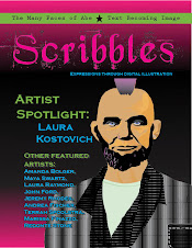
Assignment: To create an illustration of Abraham Lincoln using Adobe Illustrator.

Craft:
1. Learn to use Google Image.
2. Obtain a picture of Abraham Lincoln from Google Image. Use an image that is made up of a lot of pixels.
3. Learn to use Adobe Illustrator.
4. From there create an illustration on Adobe Illustrator of the Lincoln picture obtained off of Google.

Composition: I chose this photo of Lincoln because it was larger and focused more on his face. This was not a photo of Lincoln standing or a full body shot of the president. I liked that the face was the focus of the picture, and there was not much else to distract the viewer.

Concept: The concpet is to use a photo of Lincoln to illustrate. This exercise will teach me to use Adobe Illustrator and learn the features it has to offer.

Monday, January 12, 2009

Week 1


Assignment: 
Set-up blog

Craft: 
1. Obtained a photo of myself from facebook.
2. Created and confirmed a gmail account.
3. Created a blog on blogger.com 


Composition: 
I chose this photo because it was a photo taken from when I was hanging out with my friends.  It shows me holding a small toy that is an inside joke between my friends.
This template was chosen because it seemed to be a more colorful template than the others.

Concept:
I am Laura Kostovich

I am the happiest when I am drawing or with my friends, family, or boyfriend.

I am going to be a medical illustrator and going to graduate school.

The last time I was tested was last semester, my time management skills were tested.

I get out of bed in the morning in order to get an education.

I feel exhausted.