Tuesday, March 31, 2009

Week 10


Assignment:

To create the last 10 spreads of our magazine.

Craft:
I used indesign to create the last ten spreads like I did for the first ten spreads. There were a lot of baoxes used to design the spreads. Making these last spreads was easier than the first ten because i had templates that I already had created.  That made the last ten faster to create.

Composition:
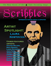
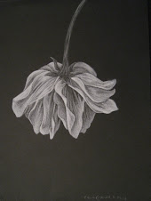
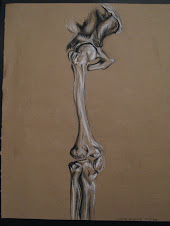
There were many boxes used to create the layouts. All the spreads consisted of a title, byline, body text, and image. The colors used for the fonts I tried to pull from the featured art on the specific spread. The font I chose I also tried to keep it as the same style as the artwork.

Concept:
The concept of the magazine is to keep all of the spreads similar, so that there is no confusion by the reader. I tried to use the same formula for each spread.

Thursday, March 26, 2009

Week 9


Assignment: This week we were to create 10 spreads.


Craft: These 10 spreads were made using the program Indesign.

Composition: All the spreads were based on the artwork that the spread was featuring. The pages would have the color schemes chosen from the artwork along with the title fonts. These spreads also were created with the same basic formula made from boxes. Every spread has the same formula of title, byline with artist's picture, body text, and featured artwork. The same font size and style was used for the body text throughout all 10 spreads.

Concept: The overall concept of the spreads are to keep them simple with interlacing themes that bring them together. The point of the interlacing themes are so the magazine will come together as a whole when it is published.

Wednesday, March 18, 2009

Week 8


Assignment:
To create 2 magazine spreads using both our Lincoln illustration and the text/illustration creation.

Craft:
I used Indesign in order to create the two magazine spreads. These two spreads were created in order to incorporate the element of boxes. Looking at magazines in box -form makes it easier to create magazine spreads.

Composition:
The magazine consists of illustrations that take an entire page of the spread. The spreads were created with boxes in mind. So both spreads have boxes for the headline, byline, and body text. There were additional boxes that acted as accents. These accents pulled out certain designs from the featured illustrations.

Concept:
The concept of these spreads are to have the focus be on the artwork. The artwork takes up most of the spreads. And the illustrations also inspired the colors for the headlines and bylines. There were also accent boxes that took elements from the main illustrations. All the elements of the spreads lead the reader back to the artwork. The text is secondary in this magazine.

Tuesday, March 10, 2009

Week 7


Craft:
I used Adobe Illustrator and played with the text following a path, gradient, font, and pencil tools. These features allowed me to bring a treasure map to life.

Composition:
The piece has a worn old parchment paper in the background that aids in the visual clue of seeing a treasure map. The arrows are made out of words. These words were typed in Lambretta font that give a natural boxing-in of the words to make them appear more arow-like. There are three major building scenes that I have to pass through. There are also gray symbols that represent things that are earned at each building scene.

Concept:
The concept of this illustration is that there are different forms of schooling that I must pass through in order to achieve my dream job. I started to take school seriously in college and that is also the point where I decided I wanted the dream job of being a medical illustrator. So my treasure map starts at college and travels through graduate school and finally to where I find my treasure in the city when I am hired as a medical illustrator. The different icons that are on the map for each place are graduation caps (college), diplomas (graduate school), and money (the city). The arrows that represent the path I must take in order to achieve my goal are made out of words that read "determination, perserverance, hard work, focus...are used to achieve my ultimate goal."

Lincoln Editorial

“Punk Union” Lincoln Editorial

Craft:
For this project I used a photo of Abraham Lincoln that I had found using Google image search. I made sure to choose a picture that was made up of a lot of pixels so that it was easier to work with and manipulate. This photo aided me while I used Adobe Illustrator to create the different variations of Lincoln and the final product. A few of the features of Adobe Illustrator that helped the most in this creation were text, gradient, swatches, opacity, pen tool, and the pencil tool. These tools were the ones that I used to create all the Lincoln variations and the final “Punk Union” Lincoln.

Composition:
The composition of this project started with the photo of Lincoln that I chose. I chose this photo of Lincoln because it was larger and focused more on his face. This was not a photo of Lincoln standing or a full body shot of the president. I liked that the face was the focus of the picture, and there was not much else to distract the viewer. When this project started I knew that I did not want my Lincoln illustration to be realistic. I did not want a realistic illustration because when I heard Adobe Illustrator I thought of cartoons rather than photos or realistic works of art. Keeping align with the cartoon mood of this piece I chose to make President Abraham Lincoln into a punk rock musician. In order to do this I had to adjust of few key pieces from the iconic photo I was illustrating from. His suit was changed to just a sports coat. The collared shirt was switched for a mint green t-shirt. The most iconic element of Lincoln that I altered was his hair. The hair is definitely an eye-catching part of this illustration. The purple Mohawk I created stands out as the key stereotypical element of this picture that allows the observer to automatically think punk or rebel. Lincoln is framed between text to give him a border. The vintage concert poster background catches the eye but does not take emphasis away from the main part of the composition...Lincoln.

Concept:
Throughout this whole creative project there were different variations of Abraham Lincoln that I created. The variation that I chose for my final finished piece was the punk rock Lincoln. In order to emphasize the concept of a rebel/punk Lincoln I wanted to put Lincoln in the center of a vintage concert poster. Then as his 'emancipated and united tour' progresses he goes through the different civil war battles. His band name of "Punk Union" also gives emphasis to Lincoln's new style.