Wednesday, February 25, 2009

Week 6


Assignment: To create an illustration combining text and pictures.

Craft: To use Adobe Illustrator and the Linotype Font Explorer X.

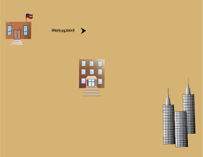
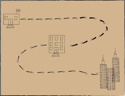
Composition:  I have decided to use a map to show that there is direct path to be reached.  The path is made of arrows that will soon be turned into words.  There is a college, graduate college, and the city which represents office buildings.

Concept: The composition is based around the idea of a treasure map.  This is so because I want to convey that there is a linear progression to achieve my goal. In this progression the ultimate goal is my dream job and considered the treasure. 

Tuesday, February 17, 2009

Abe at my house :)


Abe in his new home. :D

Week 5


Assignment: To use both text and pictures for the project.

Craft: To use Adobe Illustrator. Also this project deals alot with familarizing and utilizing the text feature on Adobe Illustrator.

Concept: I'm not sure what the concept of my piece will be yet. I would like to use books and coffee in the picture, but I'm not sure where the text fits in unless the books are textbooks and the words are "My life as a student". Much of my time during the school year is taken up with studying and coffee is normally what I drink in order to stay awake to study.

Composition: I will want the coffee cup to be on the left hand side of the book while also in the foreground. The textbook will be open and the left cover will be resting on a stack of books. The words will be in the upper right hand of the illustration. I envision this piece having a sepia color scheme.

Wednesday, February 11, 2009

Week 4


Assignment:
To put Lincoln in a background that suggests or emphasizes the chosen variation.

Craft: 
For my Lincoln I used a lot of text and and gradient.

Composition:  
Lincoln is framed between text to give him a border.  The background catches the eye but does not take emphasis away from the main part of the composition...Lincoln.  

Concept:  
The variation that I chose was the punk rock Lincoln.  In order to emphasize the concept of a rebel/punk Lincoln I wanted to put Lincoln in the center of a vintage concert poster.  Then as his 'emancipated and united tour' progresses he goes through the different civil war battles.  His band name of "Punk Union" also gives emphasis to Lincoln's new style.

Tuesday, February 3, 2009

Week 3


Assignment: To use the original illustration of Lincoln created last week to create three different variations.

Craft: I experimented with other aspects of Adobe Illustrator. I used opacity, different stroke sizes, swatches, and gradient. These all helped to improve the Abraham Licoln variations to bring each one their own style.

Composition:
Modern Lincoln: I used a gradient to create a suite that looked like it had a realistic shading to bring a more modern approach to the portrait. I switched his traditional bowtie for a modern necktie.

Punk rock Lincoln: His suit was changed to just a sports coat. The collared shirt was switched for a mint green t-shirt. The hair is definately an eyecatching part of this illustration. The purple mohawk stands out as the key stereotypical element of this picture that allows the observer to atomatically think punk or rebel.

Happy Lincoln: The subtle uptrun of the lips of this piece give Lincoln a sense of peacefulness and happiness. The other element of this piece that gives the same feeling is the toning down of his skin color and his suit.

Concept: I am torn between putting the modern Lincoln in a newsroom and having him interviewed. But if I were to do this I would want it to seem as though you are watching this on TV, with the little feed that runs across the bottom of the screen and the network logo on the top. If I chose to use the Punk rock Lincoln he would probably be at a rock concert or seen in an old touring poster for his band 'Redefined Rebel'.