Assignment:
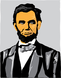
To create a digital illustration of Abraham Lincoln using Adobe Illustrator.
To create a digital illustration of Abraham Lincoln using Adobe Illustrator.
Craft:
1. Obtained started illustration from last week.
2. Learned new techniques on Adobe Illustrator by professsor and on my own.
3. Brought out the main highlights and shadows of the original image.
4. I only used the pencil tool and the color guide to create the image.
Composition:
I chose this photo because it was a stern looking Lincoln and focused on his face, rather than his entire body. The main idea for my illustration was to keep it cartoon-ish. I did not want a realistic illustration because when I heard Adobe Illustrator I thought of cartoons rather than photos or realist works of art. I used highly contrasting highlights and lowlights in the suit and tie of Lincoln. The hair and beard only have a few small patches of highlights to give the texture of hair. I did not want to do all of the hair and beard with varying strands of grayscale colors because this would have looked too overdone and distracting. The main color for the face is not a normal skin tone color because I did want to keep it cartoon-like. I played around with the color guide until I found skin tones that were slightly darker or slightly lighter than the original color I chose for the face to give the higlights and shadows. Overall I feel this Lincoln did in fact turn out cartoon-ish.
Concept:
I feel that this photo emphasizes that Lincoln is sitting so he should either be in a library or in the oval office.


No comments:
Post a Comment